The Start menu is finally back in Windows 10, but a lot has changed since we last saw it in Windows 7. From a visual standpoint, the first difference you'll notice is the addition of live tiles, which occupy the right half of the Start menu and provide quick information from your "Universal" Windows apps.
For some folks, the addition of live tiles isn't exactly a desirable feature, as they take up quite a bit of space and make your Start menu much bigger than it needs to be. So if you prefer a slim, clutter-free Start menu, you'll be happy to know that these live tiles can be removed, which will then allow you to shrink your Start menu down to a single column.
Remove All Live Tiles
If you're looking to shrink your Start menu down to a single column, start by removing all of the live tiles from the right-hand portion of the menu. To do that, simply right-click any live tile, then select "Unpin from Start."
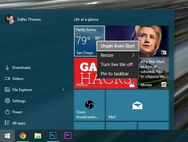
Repeat this process of unpinning live tiles from your Start menu until you are left with none. At this point, your Start menu should look a lot less cluttered, but it's still a bit too wide, so we'll fix that next.
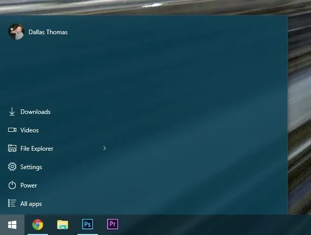
Shrink Your Start Menu Down to a Single Column
With all of your live tiles gone, simply hover your mouse pointer over the right edge of your Start menu. When your mouse pointer changes into a double-headed arrow, click and hold your left mouse button, then drag the edge of your Start menu over to the left.

After dragging the edge of your Start menu as far over to the left as possible, you'll be left with a clean, single-columned Start menu. If you'd like, you can also shrink the Start menu vertically by dragging the top edge downward.
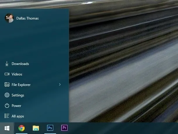
Did you shrink your Start menu down to a single column more because you're a fan of simplicity, or was it because you just don't like the new live tiles? Let us know in the comment section below, or drop us a line on Facebook, Google+, or Twitter.










Comments
Be the first, drop a comment!